Bogus forecast

The Economist describes the boom in digital mapping with a story including the most preposterous graph of 2017.

The graph appears to be a solid, clean, better than average business bar chart.

But it only has one actual data point! And we don’t learn what amount that is. There is a phrase for an untethered forecast reaching more than 30 years into the future. It is made up.

History and forecast

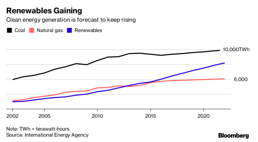
A recent Bloomberg article describes the rapid growth of solar power generation. This graph compares the trend for all renewables to the main fossil fuels used for electricity generation.

The graph is nice and clean. It includes the main message in the title and subtitle. There are only three curves and the have distinct colors. (But shouldn’t the renewables be green?) The axes tick labels are simple, which is adequate since we are not invited to pay attention yearly details.

The graph would be improved if the forecast parts of the curves were indicated. For example using dashes.

China is installing solar capacity much faster than any other country.

The message is well expressed in the subtitle. And it’s a relief that the graph is not a pie chart. The heights of the columns are much easier to compare than the areas of slices would be. The emphasis is on the first and tallest bar, so it does not need to be a different color for emphasis.

Interestingly the article states that the primary motivation in China is concern in the population about air pollution and environmental degradation, while the main driver in the United States is economic.

Clutter

A recent article in The Economist is titled Women alone are driving a recovery in workforce participation. An accompanying graph is suggestive but far too cluttered.

Long point labels usually don’t work. A horizontal bar or a dot graph would work well for the long category names. Unfortunately neither is available in Excel. This graph provides the idea.

The evidence is a bit more nuanced. The one category dominated by women had the largest growth. The three categories dominated by men had the smallest growth. The more mixed categories had mixed growth.

Stacked bar chart

It is not news that we watch a lot of TV in America. Nor is it news that the time spent staring at a smartphone is increasing. But it may be disconcerting that total viewing time is increasing.

And that is the take away from this stacked bar chart. We can quickly see that total viewing time has increased more than one hour over only two years. Smartphone viewing has approximately doubled. Tablet viewing has also approximately doubled, but from a low base.

The main point of the article is that there is a looming battle between smartphones and TV screens for video viewing. This is not really addressed by the chart, only a few numbers in the story. Perhaps an additional chart would have helped.


Stacked bar chart

The Economist recently reported that the decline of infectious diseases in developing countries will mean that care for chronic conditions will be more important.

The trend for these two cases is shown in a stacked bar chart.

The argument would be a bit more compelling if data for 2010 were included.

The stacked bar presentation works well because the values sum to 100%, there are only two values per stacked bar, and The Economist does not like to use tables in articles. The bars are somewhat redundant, but they display the relative values at a glance. It is appropriate that only the chronic case is labelled since it is the focus of the article.

Prediction bias

“Predictions are hard, especially about the future.” Often attributed to Yoga Berra, it appears that the original author is unknown. (http://quoteinvestigator.com/2013/10/20/no-predict/) Nonetheless, this statement is clearly true.

This graph of world GDP growth contains 42 predictions, almost all too high. This consistent prediction bias does not happen without incentives. The outcome is so consistent that its presenters must believe that optimism is more important than accuracy.

The graph is drawn to show that the 5 year predictions are all 4.5+, when the reality is usually about 3.5. In some cases even the one year predictions are significantly high.

Another way to look at the data is to observe the predictions that are made in any one year. That is to read the graph vertically rather than following the lines. This is another way to see that the predictions for farther in the future are more optimistic.

Including predictions and actuals for years before 2011 would be interesting, even if the graph still begins with 2006. Similarly it would be interesting to see if predictions for years beyond 2017 are still so optimistic.

Source: The predictions were developed by the International Monetary Fund (IMF) and published in their semi-annual World Economic Outlook.

Unlikelihood

Incentives have effects. They just may not be effective for the desired outcome.

Starting in 2004, each province in China received from the central government a set of “death ceilings” that, if exceeded,  would impede government officials’ promotions. A result:

The paper by Fisman and Wang asserts, with strong evidence, that the officials just reported manipulated numbers (alternative facts). They digested quarterly reports for 7 categories in 31 provinces over 8 years. The analysis and results would not have been clear without graphs like this one.

The authors point out that the program may have actually been effective–if the central government objective was really dissent minimization. They would not be the only government with that as a priority.

Showing changes

Europe is decreasing CO2 emissions. The United States not so much. And the Europeans will find it difficult to meet their Paris treaty commitment. [The Economist July 8, 2017]

The accompanying chart is relevant but murky.

The chart baseline is 1997, but the treaty reference is 1990. There appears to be little difference between the EU and the US on this scale. China appears to have a huge output but is not mentioned in the article.

Charts that show percent changes from a year are common in finance but can be questionable. Why was that year chosen? Is it representative? Are the series close enough in scale that the comparison makes sense?

The data look like

This graph makes it clearer that the EU is decreasing emissions faster than the US. Also China is clearly not going to achieve a 40% reduction from 1990, but its output is only about twice the US—rather less dramatic than suggested in the original chart.

Data from

Statistics Explained (http://ec.europa.eu/eurostat/statisticsexplained/) – 16/06/2017 and

Source: Boden, T.A., Marland, G., and Andres, R.J. (2017). National CO2 Emissions from Fossil-Fuel Burning, Cement Manufacture, and Gas Flaring: 1751-2014, Carbon Dioxide Information Analysis Center, Oak Ridge National Laboratory, U.S. Department of Energy, doi 10.3334/CDIAC/00001_V2017

A sketch can work

A graph can be good without being dry and sober.

This one has the character of a rough sketch. Yet it communicates better than plain words and has more emotional resonance than a polished graph would. Even without refinements, we have an expectation of how to read a time series plot that works for this example.

The grapher is Charles Hutton, and he’s a hoot.

Interestingly Charles Hutton is also the name of the man credited with inventing contour plots in 1778.