Compare to expectation

Spotify dominates streaming music, which has been a good thing for the music business.

This domination is even stronger than we might expect. The sizes of top ranked collections, for example the largest cities, are often related by a power law. This observation is called Zipf’s Law.

The number of Spotify subscribers is substantially larger than Zipf predicts.


Stacked bar chart

A recent article in The Economist discusses the spread and possible future struggle of Amazon and Alibaba. Many countries offer room for growth.

This is an excellent example of a stacked bar chart. It avoids common problems.

The bars sum to 100%, so their heights are uniform and comparison is easy. With only 3 categories, there are not too many labels or tiny bars.

The messages are clear. In India and China, many people are not yet online. In every country except India, a strong majority of people online are shopping there.

Log scale

Bitcoin is a major phenomenon of out time. There is nothing like very rapid growth to generate excitement.

As is often the case, this linear scale plot obscures rate of change and the small early values. It is worth also looking at a log scale plot.

The early adopters had the best earning potential.

Some people talk about the promise of bitcoin as the new money. Of course this price history shows that it would have been amazingly deflationary. Hardly a good thing.

The price of bitcoin is financial, but its cost is environmental. “Mining” bitcoin takes a huge amount of electricity, and the major mining countries rely heavily on coal fired power plants.

The scale of this electricity consumption can be compared to countries.

The choice of a bar chart is appropriate, as is ordering the countries so that the longest bar is at the bottom, nearest to the scale. The small drop shadows, however, only add blur.

Meaningless bar chart

In October 2017, the Council of Economic Advisers, an agency within the office of the President, released a report on the effect of a proposed corporate tax cut on wage growth. It was not widely praised. The report predicts that:

“Reducing the statutory federal corporate tax rate from 35 to 20 percent would, the analysis below suggests, increase average household income in the United States by, very conservatively, $4,000 annually.”

and

“Using 2016 household income as the baseline, these effects translate into an increase in average household income from $83,143 in 2016 to between $87,520 and $92,222, an increase of $4,000 to $9,000 in wage and salary income alone. (See Figure 2.)”

The bar chart in Figure 2 clearly and compellingly shows that 9000 is more than twice as big as 4000. The competition is strong, but this is clearly a candidate for dumbest graph of 2017.

One of the basic guidelines in graph design is that the quantity axis of a bar chart should include zero. In this case, that means plotting income and changes. If a bar chart is needed, it should look more like this.

The predicted increases are 5 and 11%. The authors do not state when the income increase will be fully achieved, but the report suggests 7 years out. This would correspond to annual growth of 0.6 to 1.3%, similar to the 1.1% average rate that occurred from 2008 to 2016.

Perhaps the authors are asserting that the income growth rates would add so that the total would be about 2%. That is a growth rate not seen since 1974, when the corporate tax rate was much higher.

Who are these people? Is that the best they can do for justification?One hint is the the Chair is Kevin Hassett, perhaps best known as the co-author of Dow 36,000 in 1999.

Bogus forecast

The Economist describes the boom in digital mapping with a story including the most preposterous graph of 2017.

The graph appears to be a solid, clean, better than average business bar chart.

But it only has one actual data point! And we don’t learn what amount that is. There is a phrase for an untethered forecast reaching more than 30 years into the future. It is made up.

History and forecast

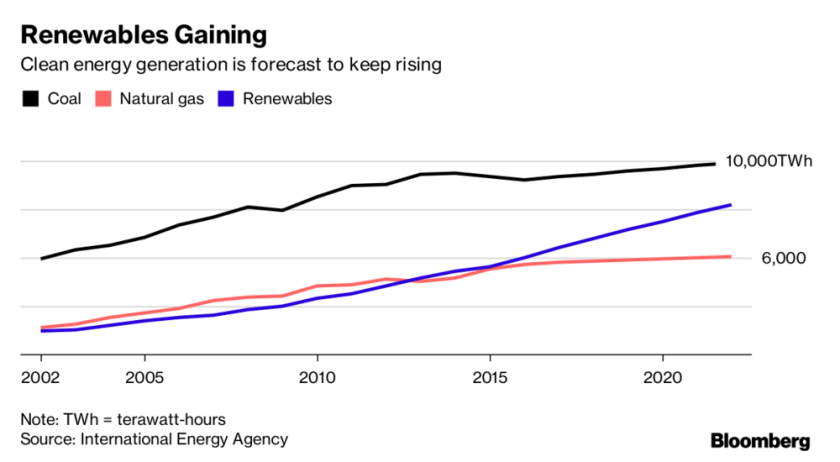
A recent Bloomberg article describes the rapid growth of solar power generation. This graph compares the trend for all renewables to the main fossil fuels used for electricity generation.

The graph is nice and clean. It includes the main message in the title and subtitle. There are only three curves and the have distinct colors. (But shouldn’t the renewables be green?) The axes tick labels are simple, which is adequate since we are not invited to pay attention yearly details.

The graph would be improved if the forecast parts of the curves were indicated. For example using dashes.

China is installing solar capacity much faster than any other country.

The message is well expressed in the subtitle. And it’s a relief that the graph is not a pie chart. The heights of the columns are much easier to compare than the areas of slices would be. The emphasis is on the first and tallest bar, so it does not need to be a different color for emphasis.

Interestingly the article states that the primary motivation in China is concern in the population about air pollution and environmental degradation, while the main driver in the United States is economic.

Stacked bar chart

It is not news that we watch a lot of TV in America. Nor is it news that the time spent staring at a smartphone is increasing. But it may be disconcerting that total viewing time is increasing.

And that is the take away from this stacked bar chart. We can quickly see that total viewing time has increased more than one hour over only two years. Smartphone viewing has approximately doubled. Tablet viewing has also approximately doubled, but from a low base.

The main point of the article is that there is a looming battle between smartphones and TV screens for video viewing. This is not really addressed by the chart, only a few numbers in the story. Perhaps an additional chart would have helped.


Stacked bar chart

The Economist recently reported that the decline of infectious diseases in developing countries will mean that care for chronic conditions will be more important.

The trend for these two cases is shown in a stacked bar chart.

The argument would be a bit more compelling if data for 2010 were included.

The stacked bar presentation works well because the values sum to 100%, there are only two values per stacked bar, and The Economist does not like to use tables in articles. The bars are somewhat redundant, but they display the relative values at a glance. It is appropriate that only the chronic case is labelled since it is the focus of the article.

Unlikelihood

Incentives have effects. They just may not be effective for the desired outcome.

Starting in 2004, each province in China received from the central government a set of “death ceilings” that, if exceeded,  would impede government officials’ promotions. A result:

The paper by Fisman and Wang asserts, with strong evidence, that the officials just reported manipulated numbers (alternative facts). They digested quarterly reports for 7 categories in 31 provinces over 8 years. The analysis and results would not have been clear without graphs like this one.

The authors point out that the program may have actually been effective–if the central government objective was really dissent minimization. They would not be the only government with that as a priority.